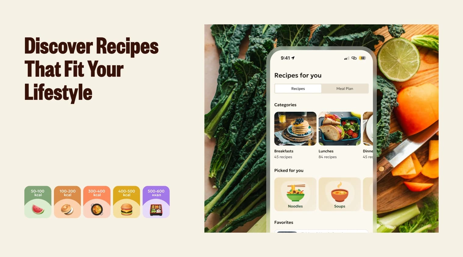
AI Nutritionist in Your Pocket
Challenge
Most nutrition apps offer generic plans that don't adapt to who you actually are. The app needed to be built around one core idea: your diet should be as individual as your lifestyle. Goals, activity level, food preferences, and daily habits all had to feed into a plan that kept adjusting, not a static template handed out at signup.
Approach
I ran comprehensive research on competitors and market trends, then did deep interviews with opinion leaders in the nutrition space to understand what was actually missing from existing apps and where they fell short. From there I built and tested an MVP extensively before committing to the full product, using that testing to validate what worked before scaling the design and feature set.
What i did
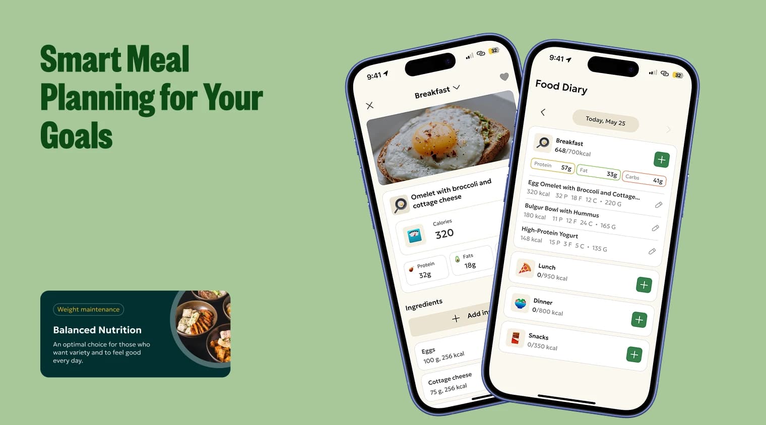
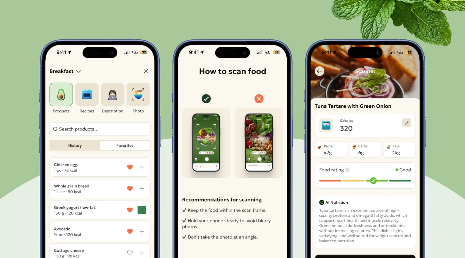
Made meal logging something people actually use. Logging is the most repeated action in any nutrition app and the most abandoned one. I placed it in a persistent quick action menu, a central plus button in the nav bar, giving users instant access to four input methods: by product, recipe, text description, or photo. All methods lived on the same screen, each with its own icon for fast scanning. The photo flow split into two clear sub options, scan a dish or scan packaging, which reduced errors before they happened. If users couldn't photograph their meal, they could describe it and the AI calculated the macros automatically.
Built search that scaled without overwhelming people. Rather than a flat database of 10,000+ items, search was personalized from day one, prioritizing groceries aligned with the user's goal and surfacing previously logged items for faster re entry. The more someone used it, the smarter it got.
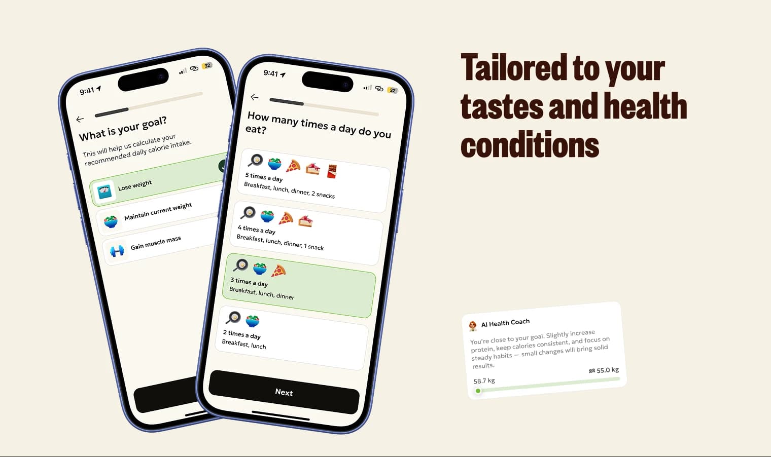
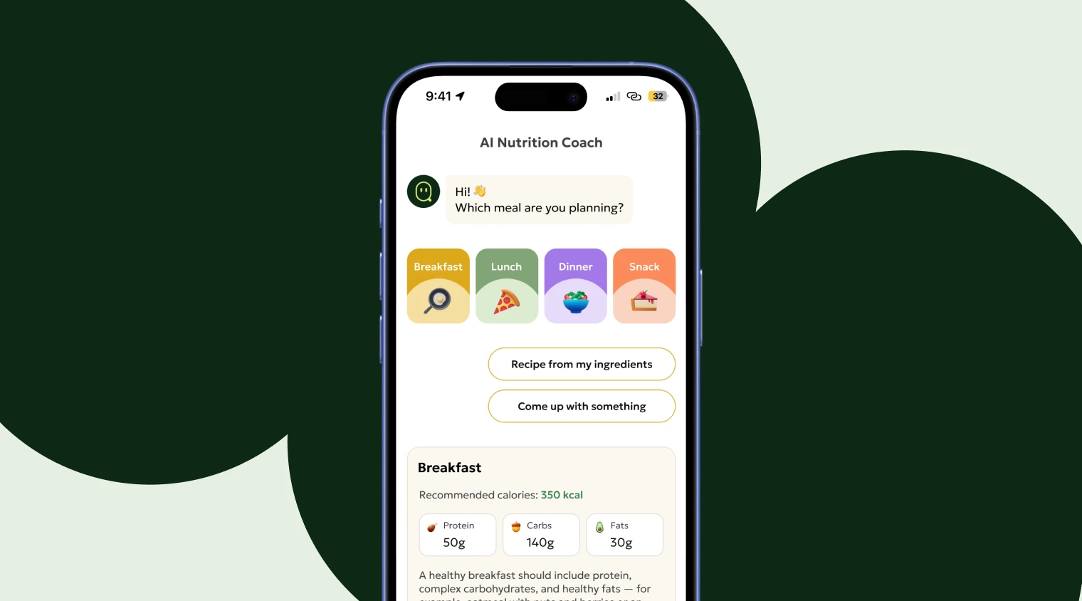
Made the AI coach feel native, not bolted on. The coach had full access to user data, logs, goals, activity, and trends, so it could make genuinely informed recommendations: diet adjustments, grocery swaps, calorie reminders. It complemented every other widget in the app instead of existing as a separate chat feature off to the side.
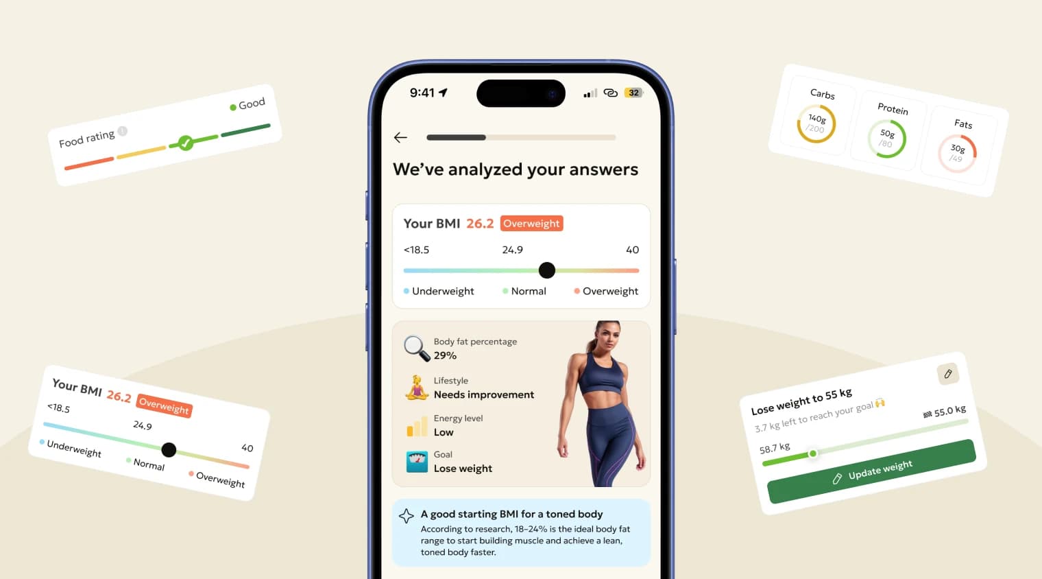
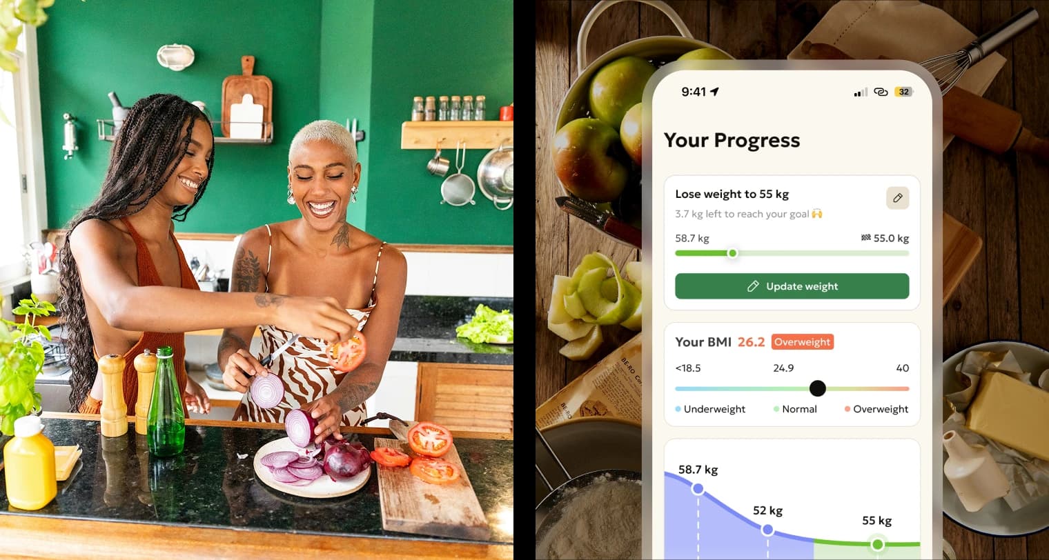
Designed onboarding to feel like momentum, not a form. Twenty questions across four groups, but between questions I showed users projected results at 7 and 30 days, how many recipes matched their food preferences, statistics from other users, and a preview of key features. The goal was to make personalization feel tangible before setup was even done. Completion rate landed at 73%.
Placed the paywall at peak motivation. It appeared immediately after onboarding, once users had already seen their plan, their projected results, and their recipe matches. Converting felt like the natural next step rather than a hard sell. The app was fully gated, no free tier and no diluted experience to fall back on.
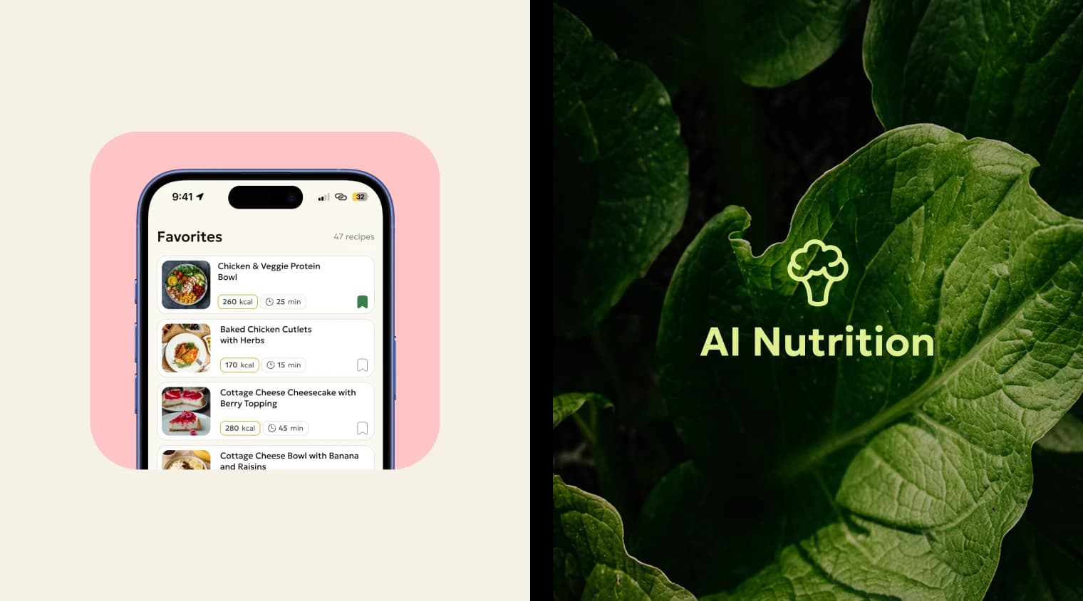
Built a recipe constructor I'm genuinely proud of. Users could build their own nutrition plan by combining app recipes, AI suggestions, and their own ideas. It's where the whole system came together: the content library, the intelligence layer, and the user's own agency over their health.
Outcome
- 5,000 monthly active users
- 8.5% free to premium conversion
- 28% three month premium retention
- 24% annual subscription share
As solo founder, product designer, and product owner, I designed, launched, and scaled this product over two years, from zero to 5,000 MAU, owning both product direction and end to end design the whole way.